Monday, July 11, 2016

Wertheimpark Memorial Fountain

Created in 1812, Wertheimpark was Amsterdam’s first park. It gets its name from the Dutch Jewish philanthropist A. C. Wertheim. From outside the gates of the park, one immediately sees a large fountain made in 1898, one year after Wertheim’s death, to memorialize the man who did so much for Jewish culture and amateur drama in the city. Jonas Ingenohl designed this fountain.
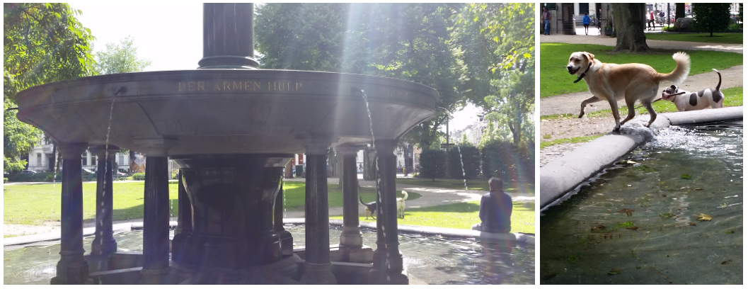
Left: Full view of the fountain. Park visitors relax and converse at the fountain as dogs play. Right: A. C. Wertheim memorialized on the fountain’s pillar. Ingenohl was a member of the old guard of architecture in a time period when younger architects sought to revive and renew design principals. The Neoclassicism of the early 1800s comes through clearly in his fountain design, adorned with a Corinthian central column atop the center and Doric ones along the base. Wertheim’s image graces the central Corinthian column, making the fountain itself a memorial. Along the disc-shaped basin from which water spouts, the designer placed Wertheim’s virtues: der armen hulp (helper of the poor), der zwakken staf (officer of the weak), der menschen vriend (man’s friend), een wekstem tot leven (a voice that evokes life), den kunst’naar tot steun (supporter of artists), den tragen tot spoorslag (impetus for the sluggish), door stad en land betreurd (mourned over by city and country) (translation from by Iamsterdam.com). The concept of remembering a man for his great deeds is a worthy one. Often in Amsterdam, there are statues devoted to the individuals who advanced the city, but the choice of a fountain in a public park (named after his death in his honor) for Wertheim seems more fitting: public parks and fountains are gifts for the masses, so even in death and memorial, Wertheim continues in his role as der armen hulp, der zwakken staf, and der menschen vriend. The fountain provides resting places along the base. Water shoots out of small holes in the upper basin. The falling of water is soothing—the laminar flow is steady so water does not get visitors wet by bouncing out of the fountain, and it is quiet enough for one to easily hold a conversation. Moreover, the fountain is quite clean, save some stray leaves from surrounding trees that have fallen in it. People chat. Dogs occasional hop in the water to cool off.

Left: Helper of the poor (der aremn hulp) inscribed in the fountain. The slow stream of water seen from the fountain as a man sits at the fountain. Marble base and columns supporting the basin are in clear view. Right: Dog exiting the fountain as another plays nearby. We see the water is clear and clean, with just some leaves scattered in it. In terms of the physical design of the fountain too, the work serves the public well. The fountain has a sturdy design that suggests strength and reassurance. The basin beneath the central column houses a larger central piece of marble that holds the water pump of the fountain in it and also supports the above basin. While this marble alone would be sufficient, Ingenohl chose to put in extra supporting columns around the periphery. The redundancy of columns and a central marble base creates a sense of reassurance; with the bulkiness of the central marble “caged” in columns, onlookers feel that the fountain is protected. These features add up to a sensibility of strength that add to an ambience of safety in the park at large. The fine details of the fountain align with Wertheim’s values of een wekstem tot leven and den kunst’naar tot steun. Creating the fountain was an act that literally supported an artist in the architect Ingenohl. And the sculpture evokes life in its details. The curves of the base marble are thigh-like. The running streams of water evoke a living flow. And the central column’s top has a bud-like cupola that reminding viewers of a nascent life. Topping the Corinthian column too are faces jutting out. These features, combined with the sound of the soothing running water evoke a sense of life to the fountain.
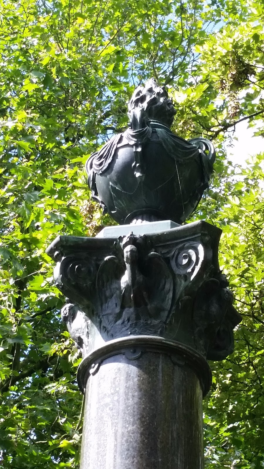
Top of the central column of the fountain.The tip of the bowl-like structure looks like a budding plant and the column has faces jutting out of it. From the fountain, visitors can see the botanical garden, trees that have grown large over hundreds of years, old Amsterdam houses across a canal, and an Auschwitz memorial. On the whole, these surroundings somehow feel appropriate with the fountain. It is difficult to place, but the botanical garden building and houses feel structurally similar to the fountain. Perhaps it is the vertical lines of the columns and falling water and the hexagonal collection basin that have a geometric similarity to the houses, which are also tall, thin, and angular. The houses near Wertheimpark are older buildings, and so the Neoclassicism of the fountain feels of the right age with those surroundings. The one aspect that feels at odds in the surroundings is the Auschwitz memorial. A modern, chilling glass structure dealing with the heavy topic of the concentration camp, the memorial has a different, melancholy atmosphere surrounding it. At perhaps 50 meters away from the fountain, it is an abrupt transition from praising memorial to mourning. The fact that Wertheim was a Jew himself might make the transition all the more stark: Amsterdam’s oldest park is named after a Jewish philanthropist who did so much for the city, and yet less than 50 years after his death, the city was unable to protect a large portion of its civilians, many of whom had done so much to contribute to the culture of the city. In this sense, it makes the Auschwitz memorial even more powerful that the transition from calm to chilling of two aspects of Jewish history in the city are so stark. View of the Wertheim Fountain from afar within the park. Plush, old trees surround the fountain. Just behind the trees, one can see bits of Amsterdam houses across the canal. Overall, Wertheimpark’s memorial fountain to A. C. Wertheim is a fitting tribute to the man. It is in many ways a living example of the man’s values, a structure of service to Amsterdam that people (and dogs) all still use extensively. The surrounding buildings and trees make the fountain a relaxing place, and the heavy repetition of vertical lines in the fountain structure and general Neoclassical design make the fountain feel at home in its location at the park. Even the stark contrast in ambience between the fountain and the Auschwitz memorial feels appropriate. Ingenohl’s design and attention to detail in the fountain support the values that Wertheim lived in his life and which are inscribed in the fountain. Wertheimpark’s fountain is a wonderful memorial and is well worth visiting.

Choosing Your Own Adventure at De Hortus

Since its establishment in 1638, Amsterdam’s Hortus Botanicus garden has taken on many roles. It was initially a medicinal herb garden, later becoming a collection of “exotic” ornamental specimens meant to highlight the Dutch East India Company’s international power. It then became a center for genetic research under the leadership of botanist Hugo de Vries. Today it is also an educational resource, a nature preserve, an art gallery, and a destination for Amsterdam residents and tourists. De Hortus’s simultaneous identities, rather than being overwhelming, shift and reveal themselves in response to the unique perspectives of visitors— an effect which is compounded by the temporary photography exhibition on display throughout the garden.

De Hortus’s multiplicity of identities is quickly made immediately evident by the pamphlets available to visitors. There are three different themed brochures with maps built around evolution, trees, and the garden’s “crown jewels.” The ticket office recommends the third map, which provides brief notes on 14 of the garden’s highlights, including the butterfly house, the 17th century medicinal herb garden, the rare cycad collection, and the humid tri-climate greenhouse. It offers a general overview of the garden for a curious but uninformed tourist— the recommended routes for visiting geneticists, botanists, and historians have different focal points and at times go off in entirely different directions.

Canopy of De Hortus's Tri-Climate Greenhouse
The existence of all these paths and routes is particularly impressive given the garden’s surprisingly small size. Tucked away in a small plot of land in the center of Amsterdam, De Hortus is given the illusion of grand acreage through densely packed branching trails which meander between paved paths. The foliage is dense enough that although there are plenty of guests, the thick array of plants shields visitors from other groups and the bustle of the city immediately surrounding them.

While the crown jewels map pinpoints notable locations or plants throughout De Hortus, it offers no prescribed route through the garden. This leaves visitors to choose the path they take through the garden according to what catches their eye. Discovering these paths and choosing one’s own route through the garden is the creation of a personalized experience of the space. One patron may stick to the paved walkways shown on the maps, while another may be inclined to try out every trail for fear of missing out on an interesting tree or narrow tunnel of bamboo. Each choice itself is tiny: climb up to the tri-climate greenhouse’s rainforest canopy or explore the ground first? Take the path along the water or the one that weaves through the conifers? Circle back and do both? Each answer on its own has only a small impact on the overall experience, but the buildup of answers to these small questions creates a path and perspective unique to the visitor.

Victoria Lily
Two visitors on the same day and at the same time may have two entirely different experiences of the gardens and may not even cross paths. Based on small scale changes in the weather and large-scale changes in the seasons, the pair’s experiences may vary even more widely. The Victoria Lily is one of the garden’s listed crown jewels, a water plant with enormous lily pads that grows only during the summer. Its flowers, one of which I was lucky to see, only bloom for two days each. The changeability of the garden’s environment with the passage of time (whether that interval is seconds or centuries) paired with its labyrinthine layout ensures that every visit results in a different experience. Individual interests in the arts, sciences, or humanities and even particular fascination with water features or endangered species are allowed to manifest themselves in the details noticed and paths taken. Even though De Hortus is centuries old and often busy, experiencing it is an unexpectedly personal activity.

Through September 19, the winning works of the International Garden Photographer of the Year contest are also on display in the garden. These photos are installed on huge outdoor plastic signs according to category and prize but otherwise seem to be scattered throughout the space randomly. It is easy to forget that the exhibition is set up in the space, only to be reminded again when stumbling upon another board of photographs.
The presentations of the photographs around the garden perhaps diminished the power of the individual works. All the images were set against a maroon background which clashed with and distracted from many of the photos themselves. The shiny veneer of the plastic was an unflattering result of the weatherproofing of the boards; it caught glare easily, speckling the images with unintended highlights and reflections. These choices presented the images less as standalone artworks (or a gallery or collection of artworks) and more as secondary, supplementary pieces to the garden itself.

Detail of Woodhouse's original photograph (above)
and its display panel in De Hortus (below)
While the images may not have been so overshadowed if they had been displayed in a gallery space, the dispersion of the photography boards around De Hortus was nevertheless successful in that it drew attention to the ideas of personalization and perspective. Matthew Woodhouse’s photograph Three is a striking black and white photograph which captures three tiny silhouettes walking through a tunnel of enormous, leaning beech trees. The photograph is moody and captivating, with layers of trees fading from black to gray to white as they disappear in the foggy distance. It isn’t well-served well by the blotchy outdoor lighting and maroon background, but its position, right under a large flowering tree which seems to almost spring out from it, creates a serendipitous continuity where the shadowy two-dimensional tree trunk becomes a brightly-lit three-dimensional one. Other photos’ placements similarly seem to echo their immediate surroundings. A photograph of a veterans’ memorial building reflected in a pool of water is situated in front of the garden’s seed house, placing the buildings in parallel with each other and drawing attention to the interplay of manmade and natural forms.


De Hortus aims to present a collection of plants that is at least semi-encyclopedic in scope, with entire gardens or buildings dedicated to particular geographic regions or species of plant, which parallels the international scope of the photos on display. De Hortus’s size does not compare to that of many of the parks depicted in the winning photographs, yet the garden’s sprawling variety saves it from paling in comparison to the photographs’ more dramatic international locales. Rather, each photo on display presents its individual photographer’s perspective in a single moment. Placing these two-dimensional photographs in a three-dimensional garden challenges visitors to be active participants and viewers of the space, seeking out and acknowledging their own frames and perspectives. It does not present a canonical perspective on how to view the garden, since none of the photos were taken in the garden itself.  Rather, it forces visitors to think about how they take in the space around them and how they choose to capture the enormous, ever-changing garden as they pass through it. 

Into the Subconscious of Loss and Fear

Questions of the meaning of life and death and feelings of loss and fear have plagued the minds of many individuals, both in past and present. In search of an answer, people have often turned to religion as a means for understanding and reflecting on the progression of life, death, and the emotions associated with them. In response, many artists have taken inspiration from churches as contemplation centers to explore these questions by means of their artwork. Oude Kerk (Old Church), in Amsterdam, has provided a space for artists to display their investigations into these topics with the Once in a Lifetime exhibition. This exhibition invites the church’s visitors to reflect on life and the mortality of the human condition. In Once in a Lifetime, Yehudit Sasportas explores the relationship between the human conscious and subconscious relations with loss and the emotions associated, such as fear and anxiety, through a film projection entitled The Lightworkers (2010).


            This work features a progression of primarily black and white images projected on a black screen in a dark room. The images consist of forest or swamp scenes, with trees toppling over and logs falling from the sky. The floor of the scape subtly mutates and warps as elements move or fall. Vertical black bars scan the scene, and a white spotlight appears and searches the scene. Ominous music plays in the background, with a constant pulse, like a heartbeat, persisting as the top layers of the music mutate with the imagery. The ten-minute video plays on loop, transcending the notion of time and expressing the ongoing feelings of both loss and pulsing fear and anxiety. Overall, the work sets an eerie atmosphere for its viewers. In this film projection, Sasportas seeks to engage the viewer’s internal thoughts and hesitations of loss and the subconscious dissection of loss in a psychological space. 

The first thing one notices when entering the viewing space of the work is the darkness of the black room, forcing one to neglect all sense of space and enter into a state of unknown. The feeling of loss created in the room is articulated by the absence of any light and concrete features—there aren’t even seats for viewing the work. Sitting on the floor of the space, the viewer blends in with the room, and the work turns into an internal experience and a mental space, even with the presence of others in the viewing space. The darkness evokes loneliness and vulnerability, allowing the other elements of the piece to penetrate into the subconscious of the viewer.

The music plays a large role in creating the atmosphere of the work. While in the room, the viewers already have a sense of loss in the physical space they occupy, but the thumping heartbeat of the music immerses the viewers even further in the psychological space, into their minds and bodies. There, they are confronted by the emotions that the other musical elements probe. A static hum playing on top of the constant heartbeat perpetuates the feeling of loss because the sound is fuzzy and has no direction in terms of musical progression. Paired with the imagery, the lack of direction of the hum creates an uneasy feeling throughout the duration of the work. Also, a synthesized piano fades in and out of the music with a mystical tune, giving the feeling of searching. The tune is slow and calm, but creates a sense of unease because of its spontaneity and lack of a clear musical ending and beginning. It also imitates the falling of the trees and logs with the falling progressions of notes. The music provides a platform to completely block out the outer world and engage fully into the feelings and thoughts that the work produces.


            The chosen scenes and imagery for the piece are strange and dreamy, and it seems as if supernatural forces play a role in the manipulation of the scenes, giving the piece an ominous atmosphere. The deconstruction of the forest with the toppling trees and tumbling logs parallels the weakening of the one’s mind when feeling emotions such as fear and loss. The warping of the floor also imitates the uneasiness and unbalanced thoughts of someone experiencing the anxiety of loss. By witnessing these elements externally in an image, but also internally as one escapes a sense of space in the dark room, emotions associated with loss are illustrated concretely, like a map of the mind. The white spotlight and the black vertical bar prompt the notion of searching for answers and understanding of the scene and what is happening, much like one does when feeling lost. At one point in particular in the film, the screen is mostly black with only the single spotlight scanning the scene. This depicts the feeling of loss extremely well and the subconscious attempt to understand the feeling. 


            Overall, the film successfully engages viewers, enthralling them in the exploration of their subconscious in the context of loss. The decision to loop the film continuously, allowing people to come and go as they please, mirrors the futility and cyclical nature of the human experience, life, and death. Just as a life begins and ends at unknown endpoints, so does the repetition of the video. One easily loses sense of time, sitting for many iterations of the video in the dark room, noticing something different in every moment of the work. Also, the work captures one’s attention in their attempt to understand what one feels when viewing the piece and what it means, and this occupation of the mind is exactly what the piece aims to achieve.

Critique: Japan Modern, on view at the Rijksmuseum

Currently on display at the Rijksmuseum is Japan Modern, an exhibition of works from the Elise Wessels Collection, the Jan Dees and René van der Star Collection, and Tokyo’s National Museum of Modern Art. Woodcut prints, posters, kimonos, and lacquerware depict Japan’s rapid modernization during the first decades of the twentieth century.

The end of the nineteenth century brought profound changes to Japan, which transformed from an agrarian medieval country to a modernized nation in the span of several decades. Changes in daily life included the introduction of trains, cars, and electricity; people began wearing Western-style clothing, and Tokyo became a modern metropolis.

Woman Applying Makeupby Hashiguchi Goyo (1918)
Two principal printmaking movements emerged during the turn of the century: shin hanga and sosaku hanga. The turn of the century in Japan was marked by optimism, as well as nostalgia -- in times of great uncertainty, artists sought to glorify the past. This nostalgia is exemplified by the shin hanga (“new print”) artists, who printed peaceful landscapes and beautiful women in traditional dress. An example is Woman Applying Makeup by Hashiguchi Goyo (1918): the soft portrait of a woman applying white powder to her neck evoked eighteenth-century prints, but the ring and art-nouveau lacquer mirror indicate that the print originated in the early twentieth century.

Portrait of the Poet Hagiwara Sakutaro
by Onchi Koshiro (1949)
Shin hanga clung to traditional production methods involving a division of labor between artist, block cutter, printer, and publisher, but sosaku hanga (“creative print”) stressed the artist as the sole creator motivated by a desire for self-expression. The style is characterized by somewhat coarser production quality and more expressive mark-making -- an example is Portrait of the Poet Hagiwara Sakutaro by Onchi Koshiro (1949), who is considered the father of sosaku hanga. A strikingly intense portrait, the dark tones and rough texture of the woodblock print hint at the sitter’s melancholy.

Breton Womanby Yamamoto Kanae (1920)
Notably, sosaku hanga was strongly inspired by artistic movements in Europe, and as such the exhibition is especially compelling for challenging the paradigm of Japonism, which posits a unidirectional transference of aesthetic ideals from East to West. While it is well-known that Japanese ukiyo-e prints had an enormous influence on Western artists (such as van Gogh, Toulouse-Lautrec, and Monet), less-recognized is the influence that Western paintings had on Japanese artists. Previously, printmaking was seen in Japan as a craft and means of reproduction, but under the influence of European ideas, Japanese artists also began to see printmaking as a form of artistic self-expression, prompting the emergence of sosaku hanga. Subsequently, Western techniques were incorporated in numerous ways. Sosaku hanga artists were more inclined toward realism, and emphasized textures and hatched lines, moving away from the simple elegance evident in previous Japanese printmaking. Western subjects also began to appear in prints, such as in Breton Woman by Yamamoto Kanae (1920) -- which depicts a favorite subject of Paul Gauguin and the Pont-Aven School, the Breton woman in her starched headdress.

The “Westernization” of Japanese prints, as evidenced by the works in the Japan Modern exhibition, proves to be a useful entry point into a discussion of East-West relations at the turn of the century. During this transitional period, the Japanese became concerned that they would lose their own traditions by becoming a part of the modern world. Did “modern” mean “Western”? Could the Japanese create a strong national identity that was nonetheless uniquely Japanese? This conversation was carried out at all levels, including in art. Thus, shin hanga and sosaku hanga can be interpreted as symbols of the two competing influences of the time. While sosaku hanga embraced Western artmaking techniques, shin hanga slavishly imitated the Japanese past, though it too showed signs of Westernization through the use of greater realism in portraits and the use of contour lines to create volume.

Given the political significance of these prints, it is somewhat disappointing that the Rijksmuseum did not highlight the overtly political aspects of shin hanga versus sosaku hanga, and its implications for East-versus-West, old-versus-new discourse. Perhaps the curators intended for the artworks to speak for themselves, expecting that such contrasts would arise from observation of prints and decorative objects. It seemed that the curators generally avoided directly addressing the complicated relationship between Japan and the West, characterized by a long period of self-imposed Japanese isolation, followed by a forced opening of Japan to Western trade. Against this political backdrop, the ways in which Japanese artists respond to the West become all the more fraught and fascinating -- but this discussion is notably underemphasized in the museum labels.

Moreover, the exhibition does not mention Japan’s military activities, which are integral for understanding Japanese modernization. At the time many of the artworks on view were created, Japan greatly increased in military might: it defeated China in a short and bloody war in 1894-95, defeated Russia in 1905, and established a colonial empire stretching across Taiwan, Korea, the South Pacific, and Manchuria. This military history could have been included in the exhibition -- for example, the First Sino-Japanese War was thoroughly documented by woodblock printmakers, and indeed set the stage for the last flowering of traditional ukiyo-e. However, none of these prints appeared in the exhibition, so the Rijksmuseum thus muted the more difficult aspects of Japanese growth: the fact that Japan’s wealth and prosperity rested on the defeat and subjugation of other peoples.


In addition, by 1920, Japan had become a constitutional monarchy with a democratically elected parliament; however, this did not address the rising spectre of right-wing nationalism and fascism in the 1930s. It can be argued that shin hanga prints helped carry some of the conservative messages of the political right, by showing Japan as a placid, nostalgic, and racially homogeneous dream; shin hanga functioned in some ways as propaganda for the ruling regime, but the exhibition does not explicitly note the political role that the genre played. By not addressing Japan’s colonial empire or its tumultuous relationship with the West, the exhibition is not entirely comprehensive, and the Rijksmuseum missed an opportunity to engage in valuable, if controversial, discussions of colonialism and the role of artworks as political objects.

The Weirdest Thing I've Ever Seen

The Weirdest Thing I’ve Ever Seen: A Review of "7 pleasures"

“It’s NOT a sex show. It’s not.”

“...but, it’s a show about sex. How is it not a sex show?”

7 pleasures is a 100 minute dance performance hosted by Julidans, an eleven-day dance festival in Amsterdam featuring young dancers and artists on the verge of international breakthrough. This particular dance is the second performance in the festival from choreographer Mette Ingvartsen, a Danish dancer and choreographer who focuses on the pleasures and power of sexuality. Her first piece, “69 positions,” features Ingvartsen as the solo performer, wandering through the audience and using her body as a platform for sexual commentary and experimentation. In direct succession, 7 pleasures continues these themes with multiple dancers constituting the same sort of platform. The performance is intriguing, creative, tense, and by far, the weirdest thing I have ever seen. However, the most successful aspect of this performance is the relatability inherent in the breadth of Ingvartsen’s choreography, while evoking a multiplicity of interpretations and reactions within each of her audience members. While Ingvartsen titles her performance 7 pleasures, the dance very lucidly illustrates both the beauty and tenderness, and the darker, dangerous aspects of human sexuality.

The set of 7 pleasures
Ingvartsen’s performance sequentially traces through seven areas of human nudity, interaction, and sexual motion, slowly building in intensity, and running the gamut of personal sexual tastes. Her audience enters the black box theater, noticing first the physical set on stage: a random assortment of seemingly normal household items: a table, a sofa, a potted plant. Searching for their seats, the audience experiences a pumping, almost tribal rhythm blasting from speakers placed strategically around the theater. The effect is that of a dance club -- the audience secretly eyeing one another, bopping their heads to the music, and feeling the growing anticipation and electricity of the pending performance. What the hell are we about to see? As the music builds in volume and frequency of beats, the audience notices a muscular female, sitting in the center of the front row, completely bare-backed. Then, a male sitting a few rows back stands up and begins to peel off his shirt, while another female to his right stands up and does the same. Then their pants, and their underwear slowly drop to the floor as the audience is electrified with the absurdity of what is happening. Slowly, twelve naked dancers appear. At first, their nudity is shocking, inappropriate, and uncomfortable. Do they not know they are naked? That we can see them? That they are on stage? They meet in the far left corner of the stage, collapsing their bodies into one unified puddle of flesh.

The music stops and the theater is silent. Each audience member is hyper aware of the others, our breaths, our nervous giggles. And then the sequence of seven scenes begins. The first scene focuses on the sensation of human touch - the bodies slowly roll and push against one another, never losing contact as the puddle travels from the far left corner of the stage, to the front right. The motion of the puddle lasts roughly twenty minutes, with no music, and merciless fluorescent lighting.  Each body moves one inch at a time, the dancers’ hands maximizing contact with the other bodies. However, the hands always trace along the more “platonic” areas of the body: the arms, the glutes, the thighs, the neck, but never tracing penis, vagina, breast, or anus. The dancers are anything but shy regarding the display of their sexual areas, oftentimes contorting their bodies into folds that only displayed the flesh of their nether regions. Slowly, the second scene begins as the dancers separate and sensually engage with the objects on stage, focusing on tactile sensations. They rub their bodies against the table, sofas, the fibers of the area rug, and bite at the leaves of the potted plant. However, again only making contact with the objects with the non-sexual regions of their bodies. Suddenly, the man in the far left corner begins to violently gyrate, flailing his limbs (and genitals) to the beat of a pulsing sound. His motion spreads sequentially across the stage to the other dancers, and they vibrate to a lively punching rhythm harkening to wild, playful sex. They smile, they shout, they thrust, twerk, and pump gleefully with one another. This third scene, this wild rumpus, illustrates animalistic, carnal, and fun sex.

The fourth scene begins as the lights dim, the bodies slow, and the rhythm softens. The dancers engage with new objects, and begin producing slowly sensual sounds. One dancer peels and eats an orange, sucking and dripping its juice on the other dancers, while others engage with metal bowls and hanging lights, making slurping and suckling and ripping noises while performing seemingly normal, day-to-day activities like ripping a sheet of paper. They then begin to tie one another to surfaces, bind each other's’ limbs, and “suffocate” against sheets of plastic, illustrating “kinky” sex for the fifth scene. It is difficult to observe the entirety of each scene at once - the audience finds themselves observing the repetitive motions of one dancer at a time before shifting to another dancer, only to return to the first and see that those original motions are replaced by new ones. For the first five scenes, the dancers were indistinguishable, moving as a unified body, or individually in synchronized, parallel motions. However, the sixth scene disrupts this pattern.

The sixth scene is the most controversial and tense, transitioning from the consensual, but darker “kinky” scene, to imagery of violence, exploitation, and abuse. Slowly, the dancers become more aggressive with one another, forceful, and antagonistic in their motions. Half the dancers then return to their clothed state, slowly donning completely black outfits, some clothed-dancers wearing the hoods from their jackets. The remaining naked dancers arrange themselves on the sofa, bent over with their backsides towards the crowd, as the clothed dancers ominously surround them. A soft rhythm begins as the dancers then grunt in unison, a terrible, painfully guttural sound, reproduced on every eighth beat. A male and female clothed dancer pull down their pants to mid-thigh, revealing only their genitalia as they watch the naked dancers keeled over and grunting in submission. This scene is highly frightening, distressing, and strained, as the dancers transition into vigorous wrestling, evoking some of the same body motions associated with rape. Finally, the scene ends, and many audience members audibly exhale.

The seventh and final scene is musical, highlighting the vocal patterns of sex. A female dancer moans to a growing rhythm, as the other dancers add to her chant. This chant grows in volume, pitch, and variety, as the dancers return to tribal, active, vibrating motions. The chant is ritualistic and assertive, yet exciting and lively, building the climax of the piece, which ends in silence and a standing ovation.


The entire experience is overwhelming and digests slowly. It stuns, shocks, and forces a full spectrum of emotional and logical thoughts regarding one of our basest instincts as human beings. Ingvartsen successfully transports her audience into a world where we can examine sexuality together, in the same physical space, while individually responding to the imagery of her dancers. Some audience members could not contain their laughter during certain scenes, while some did not find the sixth scene threatening. Some were disgusted, some engrossed, some aroused, and others embarrassed. Overall, Ingvartsen provides such a variety of images and scenes that it is impossible, with any given sexual orientation or background, to avoid instinctual reaction. She forces her audience to confront questions, curiosities, repulsions, and attractions to sex, nudity, and one another; questions that we all foster internally but very rarely acknowledge.  7 pleasures, while bizarre, is a brilliant accomplishment for both the world of dance and sexuality, spearheaded by an outlandish, fearless, and diligent choreographer.