Monday, July 11, 2016

A Review of Atelier 4's "Let's dense"


“Answering the question of how the old historic city can continue to adapt in order to play a significant role for current and future generations” (Forever Young). Such was the main focus for Forever Young one of 12 installations sponsored by Volksvlijt 2056, a project that envisions the economic possibilities of Greater Amsterdam’s future. Forever Young, a project of 180 students from the Amsterdam Academy of Architecture, “was organized as a competition in which students work[ed] together on one design” (Forever Young). One such group, Atelier 4, was comprised of 11 architecture, landscape architecture, and urban design students. Atelier 4 was challenged to redesign Amsterdam’s Haarlemmerbuurt district in a way that would “interpret and use the existing space anew” (Forever Young).

 
 Figure 1. Haarlemmerburt. Source: Google Maps

Their finished project, “Let’s dense,” started with a consideration of what the Haarlemmerburt neighborhood currently looks like. According to Atelier 4, “prices for existing spaces are at least 4,500 euro per square meter and this figure is increasing by 10% each year” (Atelier 4). Amsterdam, like many European cities, was originally built for a much smaller population. As a result, housing is cramped, small, and very, very expensive. Atelier 4 and the whole Forever Young project as a whole were not satisfied with the government’s plan to increasing housing outside the city, stating that they “believe the city is for everyone and that every inhabitant, new or old, should have the chance to buy or rent wherever they want within the city” (Atelier 4, my italics). Wherever is a strong word, but at least in the Haarlemmerburt neighborhood, Atelier 4 has a solution.

 Figure 2. Atelier 4. “Let’s dense.” Forever Young, Winter School 2016.

Figure 2 demonstrates Atelier 4’s solution to merge old and new. At first, the model is somewhat confusing; not only does their model include the “new” buildings they propose to build (the brown buildings) but their model also includes the currently existing canal houses, in white. The reason for both shapes is because Atelier 4 recognized the value of Amsterdam’s old facades, “beautiful canals and buildings, and UNESCO world heritage status” (Atelier 4). Some of Amsterdam’s canal houses date back to the 1500s. This history is a part of Amsterdam’s culture, and proposing to remove the admittedly cramped housing and replace it with more modern structures (though I’m sure such a proposal has been made at some point) in order to create more space in the city would probably have been met with varying degrees of scorn. So, to give their project a fighting chance, the artists of Atelier 4 didn’t. Instead, they proposed that “the typical Amsterdam city block should be modernized without losing its original character: behind the skin there are possibilities to create an entirely new structure and an entirely new collective inner-city block” (Atelier 4).
In the models for their “Let’s dense” proposal, Atelier 4 maintained the heart of Amsterdam. Part of what makes Amsterdam so special are these facades; they are the buildings where Rembrandt painted, where the East India Trading Company was brainstormed, where the first stock exchange was founded. They are buildings that are tied to Amsterdam’s history, and removing them would be hard for most if not all Amsterdammers to swallow.
Replacing their interior, however, is probably a little more manageable. Certainly, I am not suggesting that all Amsterdammers would immediately support this idea, or even that the majority would, but Atelier 4’s model proposes something new that forces the citizens of Amsterdam to think of what they value in their city and to evaluate space compared to history. Atelier 4’s proposal solves the problem of space without completely destroying the importance of history. In this way, their project is a success.
It is an admittedly small-scale proposal, at least for the first step. Atelier 4 parsed the Haarlemmbuurt neighborhood into an even smaller section (Figure 3 and 4), and then created designs for only one street (Figure 5 and 6).

 Figure 3. Atelier 4. “Let’s dense.” Forever Young, Winter School 2016.

 Figure 4. Section of Haarlemmerbuurt. Source: Google Maps

 Figure 5. Atelier 4. “Let’s dense.” Forever Young, Winter School 2016.


Figure 6. Haarlemmerstraat. Source: Google Maps

Figure 5 depicts the two streets Atelier 4 focused on, shown more clearly on the map in Figure 6. Other than the facades, the only structure that would remain is Posthoornkerk, a church built in 1860. Additionally, Atelier 4 also did not attempt to change the structure of the streets, stating “by preserving the special and functional structure of the streets and facades, the urban and cultural heritage characteristics are safeguarded” (Atelier 4).
Theoretically, the Haarlemmerstraat block would be the first step and, if the project was successful, this idea would stretch into the rest of Haarlemmerbuurt and beyond. However, Atelier 4 fails to consider a few important social considerations that, while their project is interesting, ultimately makes their proposal a failure.
One of the largest problems Atelier 4 fails to consider is what would happen to the current inhabitants of Haarlemmerstraat during the project. Certainly, these residents would not be too pleased to be displaced for the duration of the construction and, as Atelier 4 so eloquently argued, there is no space in Amsterdam anymore, so it’s not like they could temporarily move to other apartments within the city limits. Though Atelier 4’s project would eventually help solve the problem of space, they would (temporarily) create an even bigger problem of space in Amsterdam, and they do not have a proposed solution for the problem they would be creating. This lack of foresight is a fundamental weakness in their proposal.
Another weakness is that, in their model, Atelier 4 failed to mention how many stories the new buildings would be. In the full model, the two buildings are actually different heights:

Figure 7. Atelier 4. “Let’s dense.” Forever Young, Winter School 2016.

This inconsistency begs the question: exactly how many stories would each building be? If the goal is to maximize space, then presumably they would add as many stories as possible. However, at what point does the project transform from a project to increase housing in Amsterdam to a corporate project? If large, skyscraper-esque buildings are built in Haarlemmerbuurt, does that not risk that corporations are going to want to move in and create their offices there? And, even if that does not happen in Haarlemmerbuurt, would corporations not take the Haarlemmerbuurt project as a signal that they could do this elsewhere in Amsterdam? What’s stopping Amsterdam from becoming a city of skyscrapers with three-story-tall ancient facades?
A simple solution to this problem could be an imposed maximum building height, such as in Paris where, until 2010, buildings could not be more than 121 feet tall. This prevented skyscrapers like the Tour de Montparnasse (the building that sparked the restriction) from taking over Paris; Atelier 4 could propose the same thing in Amsterdam if they were concerned about a potential rise in the Amsterdam skyline. Yet their proposal does not include height restrictions or even proposed heights for their buildings. Like the question of resident displacement during the program, these flaws are just lack of foresight and planning on Atelier 4’s part.
Overall however, the project tackles the problem of living “inside” vs “outside” of the city in a compelling way. Living in a city like Amsterdam or Paris is often a question of wealth, but with the apartments Atelier 4 is suggested, maybe others would get the chance to move in. While the proposal does not address social changes and problems that would be caused by their project, as a beginning architectural plan, it is not only well done but very interesting. Atelier 4 thought outside the box, and their solution is exciting and original.

7 Pleasures: The Netherlands Premiere


During the Amsterdam Juli Dans festival there is no shortage of dance to be seen on weekends and weekday nights. One performance of this festival that truly explores the movement of the body through dance is 7 Pleasures. This is the second piece in the performance cycle The Red Pieces by Danish choreographer Mette Ingvartsen. By choreographing for 12 nude dancers, including herself, Ingvartsen investigates the meaning of nudity and sexuality in today’s society. Without the distraction of frivolous costumes, an emphasis is instead put on details of the dancer’s bodies. The fact that Mette Ingvartsen herself took part in the performance displays her extreme dedication to her concept and its execution. Days prior to the Netherlands premiere of 7 Pleasures, Ingvartsen danced in the solo piece 69 Positions. From this, we know that she is not shy with the audience or her body, and she brings this to the group piece 7 Pleasures.

The beginning of the piece set the mood and purpose for the rest of the hour and a half long performance. When the audience walked into the theatre, a loud and simple drumbeat was already emanating from the stage. The stage was set up with common everyday objects: a sofa off to stage right; two lights bulbs connected to tangled orange cord and to each other, so that if one was pulled down, the other would rise up; a potted plant; several chairs; a curtain comprised of hundreds of floor to ceiling plastic tubes; and a coffee table complete with coffee table books. It felt as though we were entering into a viewing of a modern living room from Ikea’s catalogue rather than the set for a dance performance. This set-up created an instant sense of intrigue. Why was the sofa set up where it was? How will the dancers interact with the table? How will the dancers even enter the stage if the stage is already lit up? The final question was to be answered soon.

After 15 minutes of percussion sounds pounding into the audience’s ears, a woman in the middle of the front row revealed her bare back. Next, a man off to the left stood up and began to unbutton his shirt. A female towards the back of the audience was already down to her underwear and down the stairs walked a man who is fully nude. One by one, the 12 dancers appeared in the audience, undressed themselves, walked with a purpose to the stage and assumed their positions. This choreographic choice blurred the lines between viewer and performer. Since the dancers seemed to come from the audience members themselves, the dancers were indeed a reflection of society itself. Usually in a dance performance, the dancers come out from backstage and set up in the dark and from that point are removed and on a different level than the audience. In those performances, the ones on stage are the dancers and the audience’s sole purpose is to watch. In 7 Pleasures, when the dancers protruded from the seats, it signified that they were one with the audience and that we were about to watch a manifestation of our own selves on stage.

In the next section of the piece, eleven dancers huddled around a black box in the corner of the stage while the twelfth lay sprawled on a chair downstage. The eleven dancers slowly morphed and moved themselves to join the twelfth dancer by pushing and rubbing along the floor and sliding over each other’s bodies. After a while, one could not tell where one body began and the other ended or who was male and who was female. It began to look like a conglomeration of limbs and movement and gave the form a living and sculptural quality. This was the first instance where the main points of Ingvartsen’s piece were made clear. Even when the dancers were extremely close and intimate with each other, it demonstrated that nudity is not inherently a sexual act. Each section of the piece had loose choreographic restrictions such as the quality of the movement, the timing, and the place in space. Beyond that, the movement was improvised, but it was never outright sexual. For example, halfway through the piece, the performers began to rub each other in time with the music. However, they never touched each other’s genitalia. The point was not to demonstrate sexual acts but to flip common stereotypes of sexuality on its head and use it to disrupt the negative connotations that sometimes come with being sexual or exploring one’s sexuality.

Use of sound from the dancers’ bodies towards the end of the piece elevated the performance to invoke a greater variety of senses. As the music grew louder and included more strange, guttural sounds, the dancers began to grunt or moan in time with the music. The timing and order of the dancer’s sounds were not random. It started with one dancer and then more and more added on until all 12 were included. The encroached onto the audience, and at one point, a dancer climbed over the seats and back into the audience.  This brought the piece to a circular closure; at the beginning, the dancers were born form the audience, they evolved on stage and discovered their sexuality, and then returned to where they came from.


By taking each separate section of 7 Pleasures out of context, 7 Pleasures could be misinterpreted as a dance solely about sex. The allusions to the sounds, positions, and different energies of sex throughout the performance point to this conclusion, but this is not the concept behind Ingvartsen’s choreography. She broke boundaries between the dancers and the audience early on in the piece and maintained a balance between comfort and discomfort. The balance allowed Ingvartsen’s choreography to push its limits and challenged how we view the human body beyond sexual purposes today. 

Friday, July 8, 2016

"Sometimes I Sit and Think and Sometimes I just Sit": Humor and Despair in equal parts with Courtney Barnett at Paradiso

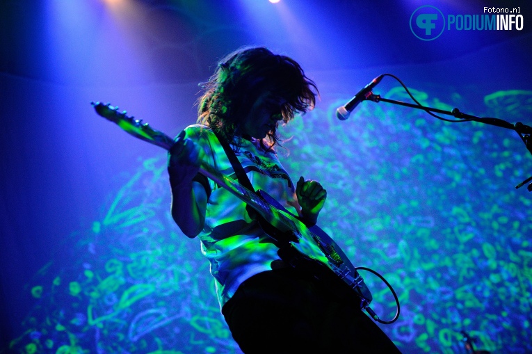
The distorted sounds of a guitar with reverb jaggedly echo across the previously-empty air-space of the venue. She enters from the left holding her guitar in her right hand, the strings of which she plucked from off-stage. Her bent-out-of-shape shag haircut, her vintage 70’s raglan tee-shirt and the delay of the white fender are all buzzing with just the right amount of showmanship. But those who know the performer aren’t too distracted by her entrance. Courtney Barnett has built a cult following around her authentic, real lyrics. She is smart but not pretentious, humble but not weak, skilled but not boastful. So I waited patiently in the audience, knowing full well that the real Barnett would soon come out.
If the Beatles, the Ramones, Green Day and Nirvana could collectively grandfather musical offspring, Courtney Barnett clearly would be their golden child. The influences of punk, grunge, garage and psychedelic are all evident in both the visual and sonic aesthetics of Courtney Barnett’s performance at Paradiso on July 2nd. The venue, Paradiso, is historic in many ways and for that reason leaves big shoes to fill. Paradiso is a church that was reclaimed in the 60’s by hippies who (legally) squatted in the building until they obtained ownership and repurposed it as an entertainment venue. But Barnett successfully filled the venue with light, sound and personality with ease.

Image courtesy of festivalinfo.nl

 Floor to ceiling projections acted as the backdrop to which various light and pyrotechnic effects such as smoke and strobes were coordinated. The content ranged from simple graphics to fully-developed visual stories. For example, the opening set of visuals was an animated (funny) story about how in a world where sharks were bad truck drivers, they would kill more people on the road than in the ocean. While the visuals were very attention grabbing, Barnett’s use of her body in the act of performance was understated and very successful. She seems to have perfectly mastered how to charm an audience through the repetition of small mannerisms. Like how she angles her head upward, creating a cascading effect with her haircut that is very “Beatles” or how she steps away from the mic and looks down and shakes her head up and down in a way that is very “Nirvana”. She has clearly studied the masters’ stage mannerisms and has used them to construct her own.
While her stage personality was an important ingredient in securing her authenticity as a performer, her choices in constructing the set list were even more effective. Every so often, she would work her way through a series of rock-inspired tracks that became progressively harder and harder until she reached a tipping point. Then, at that very tipping point, she would switch vibes entirely, and play one of her playful, self-ironic songs. This juxtaposition manifested itself most poignantly in the contrast between the songs “Kim’s Caravan” and “Pedestrian at Best.” The lyrical content of the two songs is tied. Both songs are anchored to the topic of human futility. But each song treats this heavy topic from an entirely different angle.
“Kim’s Caravan” is emotionally heavy. She talks about death, climate change, and ultimately concludes that our tendency to collapse the world into an extension of our desires is at fault. The song descends slowly into repetition, which eventually falls into a spectacular noise-pop guitar solo. The visuals and stage performance during this moment were particularly successful. The background had been a dark-looking black and white bird-like monster flying. During the crescendo, the bird sped up in time to the music. Barnett sings, “Don't ask me what I mean/ I am just a reflection/Of what you really wanna see/So take what you want from me.” She slowly progressed from singing these lines to screaming the line “so take what you want from me.” During the guitar solo, Barnett dropped to her knees on the ground, and strobes set off all around her as the swan sped up to a lightening pace. These disparate parts came together perfectly to a stunning effect. 
Full shot of Paradiso with Swan on screen
Image courtesy of roarezine.nl
Immediately after this song, there was a blackout that lasted for a few seconds while Courtney Barnett tuned. Then the lights came up on screamingly bright colors as the band played the chords to one of her most popular songs: “Pedestrian at Best.” The crowd screamed in delight, immediately recognizing the song from the chords alone. A playful mosh pit broke out in front, and many started jumping up and down with their hands in the air. During this song, for the most part, she didn’t even sing, but instead talked—slipping in and out of melody mid-line playfully. Lyrically, “Pedestrian at Best” is a self-ironic song. It jokingly talks about how she will mess up her own blossoming success and abuse all of her loving fans: “Put me on a pedestal and I'll only disappoint you/Tell me I'm exceptional, I promise to exploit you.” In a joking way, she mocks us for being there at the concert and for singing along with her. But also simultaneously she mocks herself, too, and the futility of all of her artistic endeavors. The futility of the industry, and all musicians and humans even. This critique is tongue-in-cheek and is just as funny as it is insightful. 
 Although the emotional transition between “Kim’s Caravan” and “Pedestrian at Best” was jarring, it was entirely a success. Why? Because these two songs cleverly juxtaposition the content in such a manner that brought out deeper meanings in both songs. The profound sense of hopelessness and human futility in both songs was suddenly framed in this lovely way. Both despair and humor are coping mechanisms that help one deal with existential depression. And their juxtaposition here makes me think that Barnett has intentionally left them here as if to say that neither form a singular solution to how to cope with the existential problem that is posed by many of her songs. Instead, they both constitute the antidote.  Too much self-awareness? Try a little humor as pain-relief. Too much self-deception? Maybe you need to open your eyes and have a little more insight. Barnett's performance not only upheld my expectations for her authentic persona but also led me to deeper conclusions about the inner workings of such an authentic persona. Her humor and self-awareness are evident on the surface, and it's clear from her performance they serve an important existential function. 


Thursday, July 7, 2016

Paradiso's Musical Paradise: Courtney Barnett


Indie-rock singer Courtney Barnett is a 28 year old Australian artist who put on quite a show in Paradiso, Amsterdam’s popular music venue and cultural center. She performed with her band on July 5th, 2016 as her first hall performance for the tour of her debut album, “Sometimes I Sit And Think And Sometimes I Just Sit ”.
Paradiso, exterior

The concert hall, Paradiso, is a three-story renovated church that was originally built in 1879. The church itself is of romanesque revival architecture, with features such as a number of round arches above windows on the facade of the building, thick walls, and ornate entryways.
Inside the venue, lime-green ceilings with industrial light fixtures set a playful mood upon entrance, and bright, ornate white railways line the perimeter of each story. The contrast between the traditional exterior and modern interior is energizing. Younger and older adults comprised the audience and packed the hall from the ground level up. I stood on the topmost balcony to get a more expansive view of the entire hall. The rectangular stage below was simple and bare with the exception of some sound equipment and instruments. Behind the stage hung a large, billowing white sheet—a backdrop for visual effects that would later become alive with colorful, stylized animation to accompany each song. Some of these visuals were cartoons that followed the story of lyrics closely, while other visuals were evolving 70’s-style patterns.
The simple, almost bare stage with a white backdrop, later used for visuals
The packed concert hall with white railways lining each balcony level

The instrumentation of Barnett’s band was simple and included elements typical of a rock band: vocals, a lead guitar, a bass guitar, and drums. Dressed in casual, grungy clothing, Barnett commanded both vocals and lead guitar while two men on drums and bass guitar provided backing vocals.
Garage-rock revival came to mind when listening to the first few songs, as, along with the instrumentation, the band’s energetic sound accompanied aggressive, witty lyrics that capture everyday thoughts. For example, the opening song, “Dead Fox”, criticizes consumerism with interspersed guitar and punchy, comical lyrics:

Jen insists that we buy organic vegetables
And I must admit I was a little skeptical at first
A little pesticide can’t hurt

Barnett’s vocals are not what a first-time listener would expect; while often delivered through traditional song, a decent amount of the delivery is spoken. Many of her wittiest observations are delivered in her trademark deadpan voice. Barnett takes liberty with the timing of her remarks, and while her lyrics were often hard to hear due to the loud dynamics, she delivered them in an engaging manner. However, I wish I understood what she was saying; I found myself looking up lyrics to each song on my phone to fully appreciate their creativity and wit. This, however, is a consequence of the venue’s acoustics and is not a fault of the performers. The large amount of people packed into one space combined with the emphasis placed on instrumentation made it difficult to engage with the lyrics.
There was more than enough variety in Barnett's set, which increased as the show progressed. The first few songs were in 4/4 time and were performed at a fast tempo, but were later contrasted by “Small Poppies”, a slower-tempo piece in 6/8 time. The dynamics were somewhat variable; both within songs and between them. Within the songs, the dynamics were predictable. Verses were mezzo-forte, and choruses, with denser drum and bass rhythms, were forte. Between songs, however, I was impressed by how quiet the band was able to get considering the venue and the audience’s own vocal participation. Additionally, while instrumentation throughout her set remained the same, Barnett used different accessories with her guitar, such as a delay pedal and a distortion for a few of her songs, which contributed variety to an otherwise homogenous sound.
Courtney Barnett performing "Scotty Says", notice the visual patterns projected behind the stage

The songs themselves became predictable after the first thirty seconds or so; they followed the classic verse-chorus structure common to many rock songs. The chords were fairly simple as well, hovering over four to six chords for each song. The repetitive verse-chorus structure, along with the simple chords, was great for a new listener as it became easy to participate and sing along. It was also clear that Barnett loved engaging with her audience, which furthered the inclusive atmosphere.
Not all shows are perfect. Partway through her set, Barnett’s guitar strap broke. I didn’t even realize what had happened— Barnett made it seem planned. She embraced the accident and briefly poured her energy into stronger vocals instead. I only realized what happened when a stagehand ran onstage with a replacement. The absence of the lead guitar made me realize how much dynamic and melodic power it added, and although I liked Barnett’s vocals I was relieved when the guitar rejoined the band as it added a layer of complexity to her performance.
The colorful venue, the simplicity of song structure, and the enthusiasm of both the band and of the audience made a welcome introduction to Barnett's music. On top of this, the fun lyrics, animations, and no-frills nature of Barnett's band kept listeners engaged; it was easy to find at least a handful of songs to enjoy given the diversity of the set.

Vapiano: The Rare Culinary Experience


The Italian restaurant, Vapiano was a culinary adventure that should be experienced at least once, despite the lengthy wait time, loud music, and unbearable heat. Vapiano mainly attempts to appeal to the students who work in the adjacent OBA library through its popular music and fresh, affordable food. After a brief walk from Oosterdok, my colleagues and I had the opportunity to visit during dinner.
 The main part of Vapiano spans one floor, found on the second floor of a two-story building.  Upon initial entrance to the building itself, the first floor was sparse in its design; a cashier welcomed us behind a kiosk that held menus, informed us that the restaurant was upstairs, and gave each of us cardboard cards that strongly resembled throwaway coasters one would receive at a bar. Despite their nondescript appearance, these cards were used in order to track anything we bought while on the second floor, which would then be paid for on the first floor upon exit. Although the dining experience initially seemed incongruous due to the separate floors and their functions, the card actually gave one the freedom to eat as much food as he or she would like without worrying about any sort of social pressures that can accompany eating out. Since there is no wait-staff taking your order (whose job, while also serving, is to push the meal along as quickly as possible) there is no pressure to merely get a main meal and perhaps a dessert before vacating the table for the next customer. The customers at Vapiano left when they were satisfied—whether that was after a bowl of tomato soup with some bread or two pasta entrees and a salad. The card also facilitated the payment process.
Upon reaching the second floor, there were two negative factors that were immediately obvious: the loud music, and the hot, cramped room. Vapiano as a restaurant was not necessarily large to begin with, and much of the space was taken up by the large kitchen off to the left side of the entrance. Vapiano was also almost at full capacity when we arrived. Along the center of the dining space were smaller tables, whose surfaces were covered with potted basil and rosemary. A powerful light source hung over each of them, keeping the plants fresh and giving customers the opportunity to season their meals from their seats. However, the plants’ light source gave off a fair amount of heat and that—in conjunction with the heat from the chefs’ stoves and the humidity that can occur when large amounts of people share a small space—created an incredibly hot room.
The noise level was also an issue. As a result of so many people occupying the same space, the restaurant was understandably loud. However, Vapiano also played pop music over the speakers at such a high volume that customers were forced to shout in order to speak with one another. As stated before, Vapiano is connected to the OBA library, a center where high school and college students gather to hang out, study, or work. The only explanation I can think of as to why the music was present at all is that the restaurant was attempting to appeal to their young market by creating a ‘trendy’ vibe. However, the result is that the restaurant becomes unnecessarily noisy.
 The seating situation and ordering at Vapiano was slightly bizarre as well. Once one finds a table (if one finds a table; popular times may necessitate taking the meal to-go), he or she must join a large queue in front of the kitchens to order. Vapiano chefs make the meal right in front of the customer, ensuring customer satisfaction and creating a more intimate relationship between chef and customer than is traditionally found in restaurants. The fastidiousness and care the chefs put into each meal was appreciated, but these traits became annoying when one had to wait 45 minutes to order food. The restaurant attempted to facilitate the process of ordering by having separate lines for customers who wanted pasta, pizza, or appetizers; however, there were a few issues with this system. If a first-timer unknowingly came at a popular time, it wouldn’t matter what they chose to eat, as none of the lines would be short. The other issue was that, when every customer had the ability to seat themselves, it made it impossible for every member of the group to eat together. Since people are often in line for at least 30 minutes, one person must inevitably stay behind and keep the table secure so that another hungry group does not take it. The magnetic cards, although a great way to account for a personal tab, also make it difficult to add another person’s order to it. In the end, due to the need for everyone to order for themselves, we ate at staggered times, which was disorienting because going out to eat is about eating together.
Once you reach the front of the line, watching the chef make the dish is a culinary experience. The chefs’ training was evident; their movements were practiced, and it seemed as though they could prepare a meal with their eyes closed. There was no hesitation in their work. However, I was distressed when I heard that Vapiano’s adopted phrase was “Chi va piano va sano e va lontano” in Italian or “If you have an easy-going and relaxed approach to life, you’ll live more healthily and longer” in English. As I looked at the hot and humid conditions that the chefs worked under, the quickness with which they had to mete out the food and the pressure that they were under to make said food delicious, I found the phrase ironic. These workers were not leading an ‘easy-going approach to life’—in fact, it seemed as though they were doing the exact opposite. One chef wore glasses, and the heat from the stove caused them to fog up to the point where he couldn’t have been able to see. He either didn’t have the time to clean his glasses, or instead, deemed it a futile action as they would inevitably become fogged once more; either way, he never stopped to regain his sight. All of the chefs were sweating, but none stopped to take a break. It struck me as odd that one of the pulls of the restaurant—watching my meal be prepared before me—was actually a negative experience because the chefs were clearly overworked.
However, once one returned to their seats, the chefs and lines a bit further away, he or she began to focus on the meal itself which was surprisingly delectable. The spices worked in harmony with each other and the meat was cooked just the right amount; not pink, but not cooked to the point of chewiness either.  The particular meal I chose was meant to be served over pasta, but it also worked well with the risotto I used as a substitute. In a moment of pure gluttony that only comes with particularly amazing meals, I found myself continuing to eat long after I was full, as I wasn’t ready for the mixture of tastes to leave my mouth. I understood why so many students were willing to eat here even if it wasn’t the best experience. In my time as a college student, I have found that if the food is amazing (or simply present) any negative experiences are significantly dulled.
The fresh, accessible herbs, meals to order, and magnetic cards made Vapiano a dining occurrence I will not forget. Its popularity stands as testament to the fact that despite some subpar aspects of dining (the heat, the noise, etc.), Vapiano offers great fresh food and maintains a vibe that will keep students coming back.


Monday, July 4, 2016

Authenticity and the Photograph: The Stephen Shore Retrospective

            The first thing that one notices about Stephen Shore’s Conceptual Portrait work is a certain goofiness. In a square print titled “12:30 pm,” He is turning around, and his elbow is nonchalantly cast over the front seat. His face turns to the camera directly. He sports aviator glasses, a thick mustache, and long hair, all of which were popular at the time. His gaze is intentionally calm and confident: “my car, my kingdom.”
The next square shot, titled “1:00 PM,” lies directly adjacent in the grid yet depicts the same elements in an entirely different manner. This time, the subject’s hands are on the steering wheel. His facial expression is one of hurry and impatience. He looks over his shoulder again, but this time, his expression is different. It anxiously says: “Did you just take a picture?” Though this image is one of many in a grid, it is iconic: It is one of Stephen Shore’s infamous snapshots.


Steven Shore (New York, 1947) is an infamous photographer that has made many contributions to photography as a medium. The collection currently on display in Huis Marseille contains much of his early work in which his signature techniques were first discovered. His work, July 22nd, 1969, he photographed his friend Michael Marsh at half-hour intervals for 24 hours is one of many on display. Huis Marseille is currently presenting what they call the “most comprehensive overview ever” of Stephen Shore’s work to date.
The exhibition offers the onlooker an opportunity to view many of his most popular works. The two most well-known works in the collection are Uncommon Places (1973-1981) and American Surfaces (1972-1973). These two works showcase his most innovative technique. Both American Surfaces and Uncommon Places were shot in what the writers at Huis Marseille call a “snapshot-like” manner. They claim that this style was a deliberate contrast to the serious, hyper-composed, black-and-white trend in photography of the time. Shore’s un-composed images are still trendy today and can be seen in abundance in hipster fashion stores like Urban Outfitters.
            His conceptual portrait work is far less famous than American Surfaces and Uncommon Places but is no less rich. Some of the photographs from the series bear the same “snapshot” quality that is a trademark of Shore’s work. The concept behind the work, too, is quite fascinating. The images are arranged in a grid and labeled by the time they were taken in. For example, “12:30 PM” is followed immediately by “1:00 PM” and then by “1:30 PM” and so on. From a contemporary standpoint, this concept work seems to reveal the basis of his visual thought: the desire to investigate the conditions and effects imposed by the camera on our perception of the world.
Shore was clearly particularly interested in the mediating role played by the camera in the medium of photography. The photograph is (and must always be) made by employing the technology of a camera. The camera’s content is reality reproduced: life distilled in the frame of a photo. A very famous thinker named Walter Benjamin once suggested in his work, “Art in the Age of Technological Reproduction” that in artistic reproduction, the object is mediated by the perception of the artist and by paint. Because the painter's hand (which is not mechanical) is the tool that produces the art, it contains an amount of uniqueness that a technologically reproduced work does not have. A camera, on the other hand, reproduces reality in a consistent and nearly ‘scientific’ fashion.
            Shore’s work here is the camera’s reality—yet it is augmented in several stylistic ways so as to make it appear more human. Firstly, by adding yet another trait to his art that human life is circumscribed by: temporality. The photograph normally is life frozen in a single moment. Perhaps it is an exact moment that we can peer into to get a closer look. Or the perfect moment that we want to pause. But here, we see time—exactly as we experience it, in all its mundane aspects—binding his photography. A majority of his photographs for that reason occur when his subject is asleep underneath his goofy leopard print covers. Shore is known for his ability to take the most mundane, typical activity and make it seem strange and alien. And indeed, suddenly, the act of sleeping becomes interesting for the first time. We notice details about how the subject moves in the night. He is a blanket hog and steals them from the outset of the first half hour from his girlfriend. There is an element here of voyeurism, but not in a predatory manner at all: merely because it is a chance to glance at ourselves in our own most intimate, mundane moments.

            Shore similarly amplifies reality through the juxtaposition of technique in the small space of a single frame. Each small two-and-a-half-inch square print is mounted in a grid within the same frame. They are mounted chronologically.  Though it is clear Shore is constrained by the need to move in a temporal fashion, I have no doubt that he intentionally moved between composing his shots and taking his infamous “un-composed” snapshots. The juxtaposition is rich with meaning. The contrast works to create something that goes beyond both alone. Instead, acting as a dialectical synthesis that causes one to synthesize the composed “cool guy” and the flustered geek. The only real combination of the two is a real, authentic person—who of course—is the very beloved quality of his friend that Shore is attempting to distil in the frames.


Gold Jenga Towers: Thoughts on Social Commentary


Image 1: Gold Towers made from Jenga Blocks
The OBA Library is a library which holds a number of architectural models on the first floor. One of them is pictured above, in Image 1; these two, near-identical models sit side-by-side, but the conceptual implications that may have been behind these seemingly simple towers are varied and intriguing.  These two towers were both constructed out of Jenga blocks and have been colored gold. The leftmost structure portrays a solid gold tower with no gaps or holes. The right, on the other hand, has fewer blocks, and foliage has grown in the spaces. With a cursory glance, one might believe that the two towers are nothing more than interesting Jenga constructs. However, both models—through their composition and appealing aesthetics—introduce different arguments and give insight regarding the true enemies the “modern man” faces.
Looking at Image 1, the use of individual Jenga blocks to create one continuous form is, in itself, an intriguing dichotomy. A Jenga block plays multiple roles –it is an integral piece in a large sized tower and yet, its purpose is to be removed without destabilizing the structural integrity of the tower. However, in an attempt to create a unified whole, this artist has disrupted the nature of the Jenga piece; by gluing the pieces together, the artist has removed the individuality of each block and destroyed part of the Jenga block’s function. As I stared at these golden towers, I was struck by how perfect they seemed; how even if there might have unpleasing globs of glue or stretched, marred visages of the Jenga blocks, none of that was noticeable once the gold varnish was added. These thoughts, alongside my observations of the glued Jenga blocks, reminded me of the current state of our society. It is, perhaps, this topic upon which the artist wished to comment. As I stood there, I couldn’t help but wonder if that was his message—that, no matter how hard individuals try to escape the monotony of “how people should act,” more often than not, they become another cog in the system, creating a working society that restricts the ability to make radical life changes or become true individuals. In the placement of each immovable Jenga block, I saw a person who was unable to achieve their life goals and so was stuck (perhaps not unhappily) where they were. Another aspect of note is that the artist did not remove the “Jenga” logo from the blocks; in fact, they stacked them in such a way that the the viewer is forced to see the branding. Despite changing the inherent nature of the Jenga blocks, the artist chose to keep the material’s original form. Although the pieces have been spray-painted gold—which helps distinguish the blocks as something removed from the original game—the material is still undeniably reminiscent of Jenga blocks. As such, it makes it difficult as a viewer, to think of them as true building materials instead of repurposed toys. The artist’s design might have made a stronger statement had they removed the logo from the blocks so we saw blank material instead of a brand. The logo makes it difficult for the viewer to separate what they’re seeing from being a ‘golden tower’ and ‘a gold colored tower made of Jenga blocks’. Moreover, if they had been more inspired with the building’s form—perhaps by having all of the pieces stacked in the same direction (instead of the patterned horizontal and then vertical direction necessary to play the game) or by varying the number of blocks used per row—the model may have separated itself enough from the official Jenga game to meet with more success. The artist could have taken many avenues in order to distance themselves from the idea that this is merely a tower of Jenga blocks, and that would have made it easier for the viewer to feel as though they were looking at an actual architectural model. However, despite the number of changes the artist could have made, one particular aspect of the tower seems to stand out more than the rest: the top of the structure, where the tower deviates from the pattern. With such a small change, the tower transcends the medium as it no longer follows the general format of a Jenga game. For some viewers (like myself), this area of dissonance is the most interesting part of the model, as it is the only place where the artist has taken obvious creative license. We are able to see a personal flair in the work and it reminds us once again that these aren’t Jenga blocks taken straight out of the box, but a building that came from someone’s mind. Although the clear rigidity might imply the inevitability of “becoming a cog in the machine,” this sudden deviation to freedom could remind the viewer to try; only once they do so and get away from society’s expectations will they reach the top of the proverbial ladder and break away from society’s prescribed cookie-cutter life.
However, if the leftmost tower invokes the idea of humans working tirelessly for a small chance for freedom, the right tower argues a very different point; one of inter-connectedness between man and nature. When viewing this tower, I was first intrigued by the openness the foliage provided in the structure—the start contrast to the work on the left drew my attention. While I interpreted the tower on the left as an idea for social commentary, the one on the right took on a broader notion: one of man versus nature. It should be noted that, although my believed concept for this tower differs from the first one, this tower still suffers from many of the same aspects (see above regarding the obvious logo, the three-columned rows, the stacking, etc.). Since the Jenga blocks haven’t been sanded and they are placed in the same horizontal-vertical pattern it, again, makes it difficult for the viewer to forget that they are merely staring at stacked blocks. This tower was created in a less structurally sound manner (caused by the removal of the blocks), and it is this diversion from the official Jenga game which makes this tower seem more rich in concept. Most noticeable is the addition of plant life to the building, which introduces the idea of an uncommon interaction between the organic and inorganic. Perhaps the artist wanted to call attention to the fact that foliage should be used in building projects, or merely enjoyed the color contrast of green and gold, but I saw something else when I viewed the model. The use of plant life is not balanced within the piece. It is used quite heavily on the bottom and then becomes sparser as one ascends the tower before finally reaching the top, where there is absolutely no greenery present. While starting to view from the bottom and working up, I saw a progression of the interaction of humankind and nature. In the past, the two aspects used to have a mostly even relationship, but now, entire plant species are going extinct and plants are sparser than ever before. Although one can guess that the right tower—because it mimics the left –is supposed to be a building as well, it becomes something much more conceptual due to the gaps of space. However, through it, one can also be reminded that no matter how much man can try to bend the environment to his will, nature will always take back what rightfully belongs to it. In some sense, this tower represents the beginnings of nature’s recolonization of the land; the Jenga blocks outnumber the plants, but the greenery begins from the inside (the most central and in some cases vulnerable area of a building). Nature has taken over the core of the building, where the true power lies. Interestingly enough, the top—which was the most fascinating part of the left tower—now seems dull in comparison to the other conceptual ideas being introduced by this conversation between man and nature. It seems as though the model (man) is trying to assert its dominance as a building even as the plants (nature) take control of its innards.
One last thing that needs be addressed is that fact that the two towers, with their differing core arguments, were consciously placed side-by-side.  They both seem to contain separate ideas, even if they do follow a similar color and structural vision. One might wonder what the artist was trying to convey when he positioned them like this. The idea that stuck with me, even after leaving the OBA Library, was that these are two iterations of the same building at different points in time, with the tower to the right being the future building of the work on the left. If that is the case, it would make a very poignant statement about what humankind views as important. In the present day (which the left tower, with the perceived social commentary, can be thought to represent) everyone is so focused on comparing themselves to other people and making sure that they are the ones on top. However, in the future (which the picture on the right would represent for the purposes of this thought exercise), when the world is forced to start over, it won’t matter who had the highest paying job or who lived in the most expensive house. What will matter will be survival, and being able to live in a world where humankind is no longer the top of the pyramid. In this manner, the two towers are a warning to humankind: rather than constantly striving to be the best while ignoring the other elements of the world we share life with (i.e. nature), we need to find a way to coexist, because at the end of it all, we won’t be in charge.